
Million Dollar Nonsense
I’ve stumbled across a piece of consulting GOLD. It comes in the form of a 27 page rebranding document produced by the now defunct Arnell Group as part of Pepsi’s 2009 brand refresh.
I’ve included a few selected excerpts from the document below. I’ve written captions for each image to help walk you through the most batshit crazy corporate document I’ve come across in a long time.
Enjoy!
Fun fact: the Arnell Group was owned by a global conglomerate with a name that sounds like a made up evil megacorp from a dystopian near-future sci-fi comedy. It’s called Omnicom and for those of you who are not familiar with it, it owns more than 1,500 companies in the marketing, PR, and advertising space and it’s likely responsible for inspiring many of your unnecessary impulse purchases.

Really early in the document, we start getting into some fun consulting nonsense about innovation and the future and brand DNA. This is pretty standard fare though so there’s no real indication yet of just how crazy things are about to get.

There are a half dozen pages or so that have the kind of stuff that you’d expect to see in a rebranding document. This includes some pretty straightforward analysis of the geometry of previous iterations of the logo. All this is as it should be.

Around the middle of the document, they devote three entire pages to a breakdown of the concept of the golden ratio. Seems a little indulgent but OK. Note: on the next page (not pictured here) they not so subtly rebrand the golden ratio as “The Pepsi Ratio”. I guess they own that now.

Here’s where things really start going off the rails. Somehow they manage to bring earth’s magnetic field into the equation. They incorporate multiple very scientific looking diagrams of the earth (including a cross section of the earth’s core) and then inexplicably draw random looking magnetic field lines over a couple different versions of the Pepsi logo. Not sure exactly what’s going on here but it seems very technical which I’m sure is why this rebranding project cost so much.

Let’s take a closer look at the magnetic field lines in this diagram. The field lines on one of the magnets flow from north to south while the field lines on the other flow from south to north. This is a neat physics trick. Maybe some of the scientists at the LHC can identify a new fundamental particle in Pepsi to explain that one.
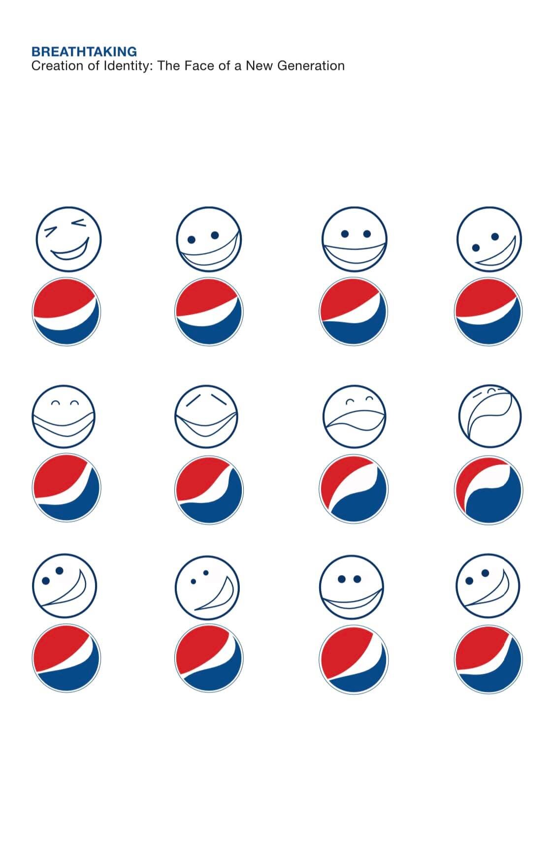
Here’s a page with nothing but pictures of slight variations of the new Pepsi logo along with the derpy happy face that each one corresponds to. It’s worth noting that there are not one but two pages with these comparisons.

I’m pretty familiar with physics and I’m also decently well versed in the basic principles of branding but this is where I totally lost grip on exactly what is happening in this document. Somehow I think they’re trying to compare a customer’s path down a grocery aisle to light’s path around a massive object like the sun. I guess I kinda see what someone was trying to do here but I’m not sure this metaphor really goes anywhere insightful or even sensical. I’m also quite puzzled by the “greater than” (>) symbol here. Maybe they’re using it as an arrow but even that just doesn’t quite make the situation any better.

At this point I think the consultants just started getting high and flipping through astrophysics textbooks for shit that looked fancy. They’re clearly talking about the expansion of the universe on the left side of the page. They even went through the trouble of adding a function (f(x)=e^x), although not a particularly relevant one. On the right they use fancy words like “orbit” and “planet” and “galaxy” and “universe”. The words and Pepsi diagrams on the right don’t seem to correspond in any meaningful way to anything that’s going on on the left side of the page.

And then there’s this little gem hanging out on the last page of the document. It says: 1 light year = 671 million miles per hour. I’m not sure where to start with this one but I guess I’ll start with the fact that a light year is a measure of distance whereas miles per hour is a measure of speed. Saying that a light year is equal to 671 million miles per hour is kind of like saying 1 second = 16 ounces. And for those of you wondering if maybe they just meant miles and the “per hour” was a typo, let me disabuse you of that notion... 1 light year is about 5.8 trillion miles. 671 million mph is approximately the speed of light in a vacuum, but how exactly any of that is relevant to Pepsi’s new logo is just beyond me.
Anyway, I hope you’ve enjoyed our quick little trip through this masterpiece of brand literature. If you’d like to see the entire 27 page document in all of its ludicrous glory, you can download the PDF here.